

As the British economic crisis becomes more prolonged the outbreak of stupidity that greets every new piece of important economic data becomes more generalised. Previously there has been a campaign to suggest that austerity has led to recovery when the opposite is the case. The recovery is based unsustainably on rising consumption, led by government consumption. The publication of the latest GDP data for most major economies has now led to wild suggestions that Britain is booming and is the strongest major economy in the world.
The level of real GDP in Britain since the recession began at the beginning of 2008 is shown in the chart below. It is compared to the US and the Euro Area. British growth has been almost exactly the same as that of the Euro Area as a whole and significantly worse than US GDP growth.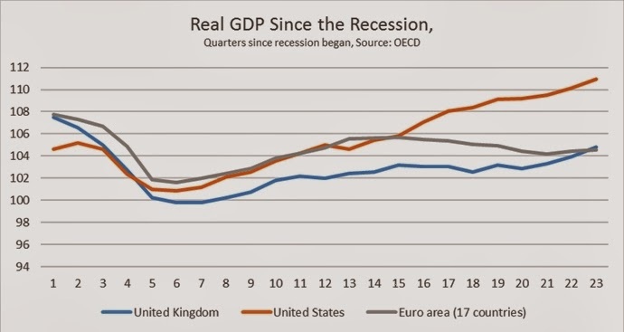

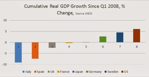
The cumulative change in real GDP for selected industrialised economies is shown in the chart below. Despite the potential advantage of independent policy setting the cumulative growth of the British economy is worse than the average, although not as poor as Italy and Spain. (The growth of the US economy is slightly overstated because official data now show that the US recession did not begin until the 3rd quarter of 2008)
Even compared to the last US recession, current performance has been variously described as ‘sluggish’ or ‘disappointing’. The US is frequently held out as a model of economic recovery. But it has recently entered its fifth year of economic expansion and GDP is just 10% above its low-point in 2009.
Authoritative economists such as Larry Summers (video) and Gavyn Davies and others have instead been discussing the ‘secular stagnation’ of the industrialised economies. Paul Krugman wonders whether this is ‘a permanent slump’.
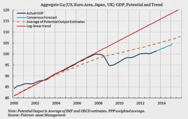
In the chart below Gavyn Davies shows the actual level of GDP in four economies combined (US, Euro Area, Japan and Britain) are shown along with the consensus forecasts for growth (the blue lines). The trend growth rate of those economies is shown the red line. The dotted yellow line shows the average estimate of potential output.
The red line represents previous level of growth whereas the dotted yellow line represents the average of estimate of what is now possible for growth. In both cases, actual and forecast GDP is set to remain below those levels for some time. But much slower growth projected by the depressed level of estimated potential output shows that the dominant idea is something close to ‘secular stagnation’ for the leading industrialised economies, something like 1.2% growth per year.
Summers and others correctly identify the main cause of the crisis as the slump in business investment, as SEB has argued. However he argues that this is because interest rates are above the level of anticipated return on investment. Yet the widely-acknowledged cash hoard of western firms belies this notion. The large firms which overwhelmingly account for investment have no need to borrow to invest as a result of this cash mountain. They are hoarding cash because the anticipated return itself has fallen. The anticipated return is otherwise known as the profit rate.
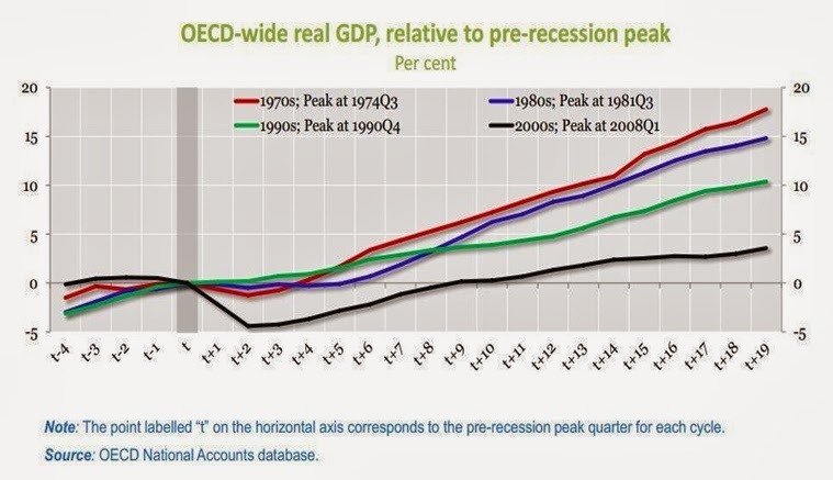
The stark long-term consequence of this trend towards declining profitability, lower rates of investment and cash hoarding are shown in a recent chart from the OECD, below. A turning-point in the world economy occurred at the beginning of the 1970s as the long post-War boom was brought to an end. Since that time each recovery from recession in the OECD has been weaker than the preceding one. The Reagan/Thatcher offensive to restore profits has led instead to a progressive weakening of the OECD economies.
The current slump had the weakest growth prior to the recession and the most severe downturn as well as the weakest recovery from it. A hat-trick of neoliberalism.
Only a complete fraudster would describe the British economy as the strongest in the world. Only someone entirely ignorant of both recent and historical economic trends would describe either current or forecast growth in Britain as a boom.
