Has the Health budget been cut?

The Chancellor today announced that Health spending would rise in real terms. But a closer look at the numbers suggest that the Health budget will fall against the baseline set out in the June Budget.

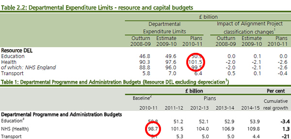
Table 2.2 of the June Budget clearly shows that the departmental expenditure limit for current spending in the Department of Health would be £101.5 billion. But Table 1 of today’s Comprehensive Spending Review sets out that the same number is £98.7 billion.

Health spending will rise to £109.8 billion by 2014-15. In real terms, the rise from the new baseline delivers a 1.3 per cent rise. But compared to the baseline set out just four months ago, the rise turns into a cut of 1.5 per cent.

What has happened to the missing £3 billion this year? If these are the the administrative savings, why have they not been reinvested in the NHS?

UPDATE 14.38:

On May 12th, Health Secretary Andrew Lansley said:

“What is sustainable for the NHS is that we deliver efficiency savings in the NHS in the same way as the rest of the public sector.

“But because of the nature of the demands on the NHS, if we can secure those efficiency savings, we can reinvest them in the NHS to deliver improving outcomes for the public.”

If the missing £3 billion is explained by efficiency savings, what happened to them?

http://www.leftfootforward.org/2010/10/has-the-health-budget-been-cut/

Osborne’s fairness claims fall flat. Again

This is a joint post by the Fabian Society’s Sunder Katwala and Tim Horton

It was striking that George Osborne made so much again of his claim that the Comprehensive Spending Review (CSR) had met the fairness test of “progressive austerity” – so that even his spending cuts would hit the better-off harder. Back in June, his emergency budget ‘fairness’ claim unraveled in 24 hours. Are his claims to a “progressive” spending review any better? The immediate answer appears to be no.

Howard Reed and Tim Horton had previously provided the most comprehensive analysis to date of the current distribution of public spending. The report, published by the TUC, showed that, based on what we knew prior to the CSR about government commitments, proposed spending cuts seemed very likely to hit the poorest much harder. (Perhaps unsurprisingly, since public spending is ‘pro-poor’, giving more help to those on lower incomes).

Today George Osborne claimed he had avoided that consequence. Yet he has published figures and documents which again prove that he has not done so. Reed and Horton will update the analysis based on the CSR numbers. But it is possible as a first step to set out why the Treasury’s claims in the distributional annex published today do not stand up.

Firstly, on tax and benefits, his chart B.5 on page 98 again shows he had preannounced measures which (thanks to Alistair Darling’s policy proposals) hit the best off harder – but the green bars show very clearly that today’s proposals are worst for those at the bottom and better at the top, with a regressive gradient across the income distribution.

What about spending on services? How does the Treasury manage to produce a graph (chart B.3 on page 95) which purports to show the greatest hit on services to the most affluent quintiles? Through very creative presentation.

On The Treasury’s own modeling assumptions (which account for and model around 50 per cent of public spending, a lower proportion than addressed in the Fabian/TUC report), we are told that the average loss of services (‘benefits in kind’) in the top quintile is £10 a week (or £520 a year) out of services worth £5,400 for those earning on average £48,700 and the loss to the bottom quintile is £7 a week (or £364 a year) out of services worth £11,500 for those earning an average of £13,800.

If the Government wanted to turn the overall pro-poor distribution of public spending to its advantage, you might then say ‘why not draw a graph showing those changes as a proportion of the lost benefits in kind’. Which is what the distributional annex does.

Changes-in-benefits-in-kind-as-a-percentage-of-2010-11-household-consumption-of-benefits-in-kind

But this makes no sense at all for anybody asking ‘what is the distributional impact of the CSR’.


What’s wrong with the Treasury’s approach and claims? It makes little sense to expresses the impact of cuts to public services (Chart B3) as a proportion of the total amount of public services received by households (rather than as a proportion of household income).

In our view this is conceptually flawed: you cannot add the value of public services received to someone’s household income in order to produce a grand measure of their standard of living, since the public services people receive are related to their underlying needs. It doesn’t follow that someone is better off because they are ill one year and so receive more NHS services than someone who is fit.

If we want to know who is hit hardest – and who escapes most easily – in the real world we surely want to know instead what proportion of their income the lost services represent. Imagine a household has to pick up the cost of services lost out of its own pocket; what matters is how much this is relative to their household income. This will be a very real consideration to people facing, say, rises in bus or rail fares because of spending cuts reducing the public subsidy.

The Treasury annex does provide the necessary figures to express impact in this way – but somehow forgot to draw the relevant diagram. The bottom quintile earn on average £13,800 and are losing £364 of benefits in kind. The top quintile earn on average £48,700 and are losing £530 of benefits in kind. Here is what the distributional impact looks like on the basis of the Treasury’s own figures.

The impact for the top 40 per cent is relatively lighter – that on the bottom 60 per cent worse:

Changes-in-benefits-in-kind

Here are the tables used:

Table-B1-B2-CSR-2010

A further concern is that today’s analysis leaves out many more areas of public spending than seem necessary, including only half of public spending in the analysis. For example, it omits all Home Office spending (including policing) as well as other things like support for rural communities, and all broad “public goods” such as defence and environmental protection. Clearly, the government does not think that these areas do not have public value for UK citizens!

The Treasury suggestion that methodological complexity makes it most sensible to exclude the value of these public goods from consideration should be challenged. A perfectly sensible approach is to include the value of public goods on a flat-rate basis – except where data is available (as in the case of the British Crime Survey) to allocate public spending more specifically. (The Fabian/Landman research was able to allocate 70 per cent of public spending on a household distribution basis, with a flat-rate allocation of remaining spending).

This matters because excluding the public value of so much of public spending changes the outcome: it suggests the distributional impact of the spending cuts is less regressive than if these important areas were also included. The government has explained why the distributional fairness test matters.

But they will need different policies if they want one of their future claims to have met it to stand up for 24 hours.

http://www.leftfootforward.org/2010/10/the-regressive-unfair-comprehensive-spending-review/

The spending review: key questions and the democratic deficit

WEDNESDAY, 20 OCTOBER 2010

Here are some of the key political debates across the enormous detail of the spending review. 

1. Are the cuts real?

A question to which the answer is Yes. There has been a concerted attempt to suggest the biggest spending cuts for 90 years are no big deal. John Redwood is among those to point to spending totals rising in nominal terms – a soundbite which lacks weight with most thoughtful observers among the pro-cuts advocates on the political right.

Tim Montgomerie of ConservativeHome wrote a cogent piece on Monday about why a the cuts won’t hurtargument would simply leave pro-government supporters stranded in a parallel universe, “out-of-touch with the real world”.

In response, Spectator editor Fraser Nelson has crunched some numbers. He says in context, the real terms total cuts to government spending will be 3.7% over 4 years. What his helpful numbers also show is that the rising costs of unemployment along with debt interest payments will mean 8% more being spent on Annual Managed Expenditure. This means 13.3% cuts – £61 billion – failling from £380 billion to £329 billion in today’s money between 2010/11 and 2014/15 – in departmental spending. Factor in the ring-fencing of some budgets, and all £61 billion is coming from other departments, averaging 18% and higher in several cases. (And don’t forget ring-fencing the NHS isn’t going to feel like no health cuts: there is a cogent argument not to ring-fence all health spending; however demographic pressures inevitably increase costs on care for those over 75 and over 85, small real terms increases will require some sharp cutbacks in health services too).

One thin silver lining of the last two months is that almost every government minister and right-wing commentator has come to value public spending in at least some areas – counter-terrorism, defence, policing, infrastructure for growth, local public services, children’s services and so on – leaving the core Taxpayers’ Alliance that most spending is just waste looking sillier than ever before.

2. Whose responsibility is the deficit?

The government has done well to establish a public narrative that the deficit is the result of Labour over-spending, even though the facts show otherwise. The difference in the deficit would be miniscule had the Conservatives been in office from 2005, because the primary cause was the necessary response to the (existential) financial crisis of 2008.

Jonathan Freedland captures why this matters to the future political debate in his Guardian’ column today:

If Labour’s spending was so wildly out of control, why did the Tories promise to match their plans, pound for pound, all the way until November 2008? Why didn’t Osborne and Cameron howl in protest at the time?

Could it be because things were not actually that bad? A quick look at the figures confirms that, until the crash hit in September 2008, the levels of red ink were manageably low. The budget of 2007 estimated Britain’s structural deficit – that chunk of the debt that won’t be mopped up by growth – at 3% of gross domestic product. At the time, the revered Institute for Fiscal Studies accepted that two-thirds of that sum comprised borrowing for investment, leaving a black hole of just 1% of GDP. If the structural deficit today has rocketed close to 8%, all that proves is that most of it was racked up dealing with the banking crisis and subsequent slump – with only a fraction the result of supposed Labour profligacy. After all, even the Tories would have had to pay out unemployment benefit.

3. Can the cuts be fair?

Claims to progressive austerity have become more muted recently. It is evident to all serious analysts that spending cuts on the scale proposed by the government – to eliminate the deficit in one parliament – will surely impact the less well-off disproportionately. Tim Horton and Howard Reed have produced the fullest pre-CSR analysis – published by the TUC – of the distributional impact of public spending and what we knew in advance about the shape of the cuts, and plan to report back this week with their post-CSR headline findings.

The government would demonstrate greater political maturity than in losing their June to August spat with the Institute of Fiscal Studies over their “regressive” first budget if they take the advice of supportive critics like Evan Harris and simply acknowledge that: the cuts can’t be fair, but they are doing their best to mitigate the unfair impact, rather than again entering another row on which Ministers are evidently wrong on the facts.

Anybody seeking to then at least follow the “progressive austerity” goal of spreading the pain as evenly as possible would look at genuine alternatives, particularly in the balance of spending and taxation and the speed of overall deficit elimination.

4. Will cuts on the scale proposed prove possible?

David Cameron is particularly keen to “reframe” departmental cuts of 18-25% as “just 5-6%” a year, suggesting many businesses have to find such efficiencies.

If you follow the logic through, what sounds somewhat plausible for this year becomes a very weak argument from the second and third years of cumulative spending cuts.

Imagine you are in charge of, say, justice, policing, transport or children’s services in a particular area. Initial cuts of 6% are almost certainly going to involve job losses and cutting back services, but will doubtless prove possible if painful. However intelligently such cuts are attempted to try to preserve service quality, the second 6%, the third 6% and the fourth 6% must inevitably cut much closer to the bone. This is where a significant question mark of whether the government can really make the cuts it proposes comes in, especially in the third year of what is proposed.

The government is strongly committed to its “no alternative” rhetoric and policy. And yet it may yet be that the hidden long-term story of the spending review may involve the government seeking to converge – perhaps rhetorically at first – towards Labour’s position of slower cuts, and taking risks to growth more seriously than they have to date. They may yet be forced to rethink the tax/spending balance by mid-term.

5. How can the spending review democratic deficit be closed?

Hilary Benn rightly points out for Left Foot Forward that one hour of debate and no vote today – followed by one day of debate in eight days time – is an absurd lack of Parliamentary scrutiny for the most significant moment, not least for a government which pledged to put the Commons back at the centre of our public and political life.

This is exacerbated by the evident lack of any electoral mandate for what is being proposed. I find it very difficult to believe that David Cameron could have believed, in his own mind, that what he was saying in the final week of the campaign. If he did, he has been on a very steep learning curve to drop his view that most government spending is waste and can be painlessly cut with no loss to anybody.

And there is a deeper issue here too. The spending framework announced in outline form today involves, implies and entails massive policy choices, very few of which have had any political or public scrutiny at all. To name just two: should social housing tenures for life be ended? Should there be no state funding of university tuition in the humanities? There will be dozens more where it make take some days to even spot the question being (implicitly) proposed by the Coalition.

By the time the media and departmental select committees try to get their teeth into what the CSR means, the government will be extremely resistant to unpicking the package it has painfully collated behind closed doors over the last two months.

Yet the rapid unravelling of the policy detail and implementation of the government’s child benefits cut a fortnight ago revealed a high level of negligence in working through the proposal which the main governing party planned to put up in lights at its party conference. does not augur well for the quality of thinking behind much of the hidden policy detail underpinning today’s announcement, where the government can reasonably anticipate that so much less attention will be paid to dozens of larger spending decisions.

So it will be worth watching today’s announcement closely, and looking at the numbers published alongside it. It will take some days – and weeks and months – for what is being proposed today in key policy areas to become clear.

http://www.leftfootforward.org/2010/10/there-is-an-alternative/

Avoid the masochistic excesses of the chopper Chancellor.

With the Spending Review just four weeks away, pressure is beginning to ramp up on George Osborne with widespread public dissatisfaction over his cuts and a challenge from his colleague, Boris Johnson, over the strategy. Pre-empting the Labour leadership candidates’ debate on deficit reduction, I gave a presentation to the Reform think tank earlier this week setting out my own deficit reduction plan which avoids the masochistic excesses of the chopper Chancellor.

My slides started with four graphs setting out the true story about the deficitpublic debt, and thebond market using figures from HM Treasury, the OECD, and Bank of England. Regular readers of Left Foot Forward will be familiar with the argument on which I elaborate below(*) but the essential point is that while the deficit has to come down, there is no compelling economic case for the pace of retrenchment that George Osborne proposes.

But since the deficit has to come down, how can we do so responsibly? My proposal is to stick to Alistair Darling’s plan to cut the deficit in half over four years but split the impact 50:50 between tax and spending cuts – precisely what Norman Lamont and Ken Clarke did in the 1990s.

This would mean £28.5 billion in tax rises by 2013-14 delivered through the 50p tax rate and fulfillment of Labour’s proposed increases to NICs. I would add to that a mansion tax, the full Capital Gains Tax rise proposed in the Lib Dem manifesto, and a doubling of the banking levy.

On the spending side, there is no need for any of the deeply regressive welfare cuts including to housing benefit, the freeze on child benefit, or tax credit reforms (though I do have some sympathy with making 16 the cut off for child benefit). Instead, I would look for an average efficiency of 8.1 per cent across all Government departments aside from DfID. This would, of course, include the Health department which makes up close to one-third of all departmental spending. A significant chunk of this could come from a 3-year public sector pay freeze (around £8 billionaccording to the SMF).

Before getting into the broad macroeconomic and specific microeconomic policies that are needed to deliver economic growth, this responsible deficit reduction would reduce growth by virtually half as much as the Tory programme. Using the cautious multipliers estimated by the Office of Budget Responsibility (Table C8 of the Budget), I have calculated that my deficit reduction plan would take just 1.5 per cent out of the economy compared to 2.7 per cent by the Conservatives.

The responsible deficit reduction plan also avoids the ideological and masochistic approach taken by the Tories. There is no need for a regressive VAT rise, no need for huge welfare cuts that will disadvantage the most vulnerable, and no need for 25 per cent cuts from unprotected departments.

Given the proximity of the Spending Review, I’d be very interested to hear your thoughts on this approach.

Recovery was fragile before Coalition’s cuts began to undermine confidence

Left Foot Forward

The ice we’re skating on is getting thinner; there’s much more good news than bad in today’semployment figures, but at the same time there are warning signs that the recovery was fragile evenbefore the coalition’s enthusiasm for cuts started to undermine confidence.

The key thing to remember when reading the labour market statistics is that they are a picture of the past; in today’s case, they’re show how things stood in early summer – May to July. The headlines in the Office for National Statistics’ press release compare these figures with the previous quarter (February to April) and that is what most newspaper stories concentrate on, but it is also useful to look at changes since last month’s figures (which covered April to June.)

These are the first statistics where practically the whole period is post-election, but of course, it is too early to say they show any effect of the new government’s policies. What stands out is the strong employment performance:

• There were 29,158,000 people in employment;

— This is 184,000 higher than the previous month,

— And 286,000 higher than the previous quarter.

• The employment rate was 70.7 per cent;

— This is 0.2 points up on last month,

— And 0.4 up on the quarter.
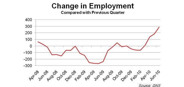
Change-in-employment-September-2010

This performance was entirely due to a 308,000 quarterly increase in private sector employment. Public sector employment was down 39,000 on the month and 22,000 on the quarter, a figure confirmed in separate figures for public sector employment released today. Employment was down in central government, local government, the civil service – every sector except education and public corporations (which includes the nationalised banks).

Over half the increase compared with the previous quarter is accounted for by a 166,000 rise in part-time employment, but full-time employment rose by 121,000 on the quarter, 44,000 compared with last month. Temporary employment is up on the quarter (+74,000) but slightly down compared with last month (by 3,000).

One point worth noting is that men’s employment, which suffered more than women’s in the initial phase of the recession, has been increasing more in recent months:

Employment-rate-by-gender-September-2010

The unemployment figures also looked reasonably good. The Labour Force Survey measure (based on asking people if they don’t have a job, are looking for one and can start work at short notice) shows unemployment at 2,467,000. This is up 10,000 on last month’s figure (though the rate is unchanged at 7.8 per cent) but down 8,000 on the quarter (and the rate is down 0.1 points).

So far the economy has done quite well on this front – eighteen months ago I thought we would have reached 3 million unemployed by now, but so far we have (just) avoided going over the 2.5m mark. Compared with the last recession, the unemployment performance looks even better:

Unemployment-1990-2010

One driver of the good news on unemployment is the decline in redundancies. In May – July this year there were 142,000 redundancies, 10,000 fewer than in April – June, 31,000 fewer than in Feb – April and 91,000 fewer than in May to July 2009. The number of redundancies is down in every industrial category except public administration, health and education and the redundancy rate (the number of redundancies per thousand workers) is down from 9.3 a year ago to 5.8 in the latest figures.

The picture for vacancies, while not quite as cheery as this is still pretty good:

No. of vacancies No. of unemployed people per vacancy
May/Jul 2009 429,000 5.8
Feb/Apr 2010 472,000 5.2
Apr/Jun 2010 490,000 5.0
May/Jul 2010 481,000 5.1

On inactivity there is good news as well, with the number of economically inactive working age people down 88,000 compared with last month and 158,000 compared with the previous quarter. The results are more mixed for the number of economically inactive people who say they want a job, however, with a fall of 28,000 on the quarter but an increase of 23,000 from last month’s figures. This is an important figure, because it is as close as we get to a statistic for hidden unemployment and if we add it to the number unemployed we get a “want work” level of 4,829,000: up 33,000 on the previous month, but down 36,000 on the quarter.

Overall, these are quite encouraging results and Yvette Cooper could reasonably claim to have handed over a labour market that was starting to reflect the GDP recovery and in better shape than it had been at the same stage of the 1990s recession. But there are signs of fragility. First of all, notice that the comparison with the previous quarter looks better than with the previous month, especially the unemployment and “want work” levels.

Secondly, the figures for the “claimant count” measure of unemployment are not as good. For most purposes the claimant count (the numbers claiming Jobseeker’s Allowance) isn’t as useful as the LFS measure – JSA is such a lousy benefit there are plenty of genuinely unemployed people who don’t qualify. But it does have the advantage of being more up to date, with the most recent figure being for August when the figure rose for the second month in succession:

Claimant count (to 5 s.f.)
June 2010 1,460,100
July 2010 1,461,200
August 2010 1,466,300

Third up, there’s been an increase in short-term unemployment. During a recovery you would expect to see short-term unemployment (under 6 months) coming down before the number for longer durations. As fewer people come on to the register, and previous cohorts either get jobs or move into long-term unemployment this should be the first sign of an improving labour market – and indeed, this is what happened last year and at the start of this year. But this month’s figure of 1,186,00 is 27,000 higher than last month and 14,000 higher than the previous quarter. This could just be a blip, but it does worry me.

Then there’s been an increase in unemployment amongst 18 – 24 year olds. This age group tends to be first out and last in to jobs, so the 4,000 increase on last month and 16,000 increase on the quarter could be another rumble on the horizon.

Finally there’s the problem of involuntary part-time and temporary work. The improved employment figures haven’t led to a reduction in the number of people who are only doing ‘atypical’ jobs because they couldn’t find a permanent full-time job – the level and the rate are still rising:

People in involuntary
temp jobs (to 3 s.f.)
% People in involuntary
p/t jobs (to 4 s.f.)
%
Feb/Apr 2010 537,000 35.8% 1,083,000 14.2%
Apr/Jun 2010 565,000 35.9% 1,079,000 14.1%
May/Jul 2010 569,000 36.1% 1,116,000 14.4%

Taken together, these figures would be very encouraging if we were looking at them confident that policies to sustain the recovery were in place. But they do not indicate a labour market that’s strong enough for us to claim that growth is self-sustaining. The fact that the comparison with three months ago is stronger than with last month could even be a hint that we were already heading into stormy waters before the cuts began.